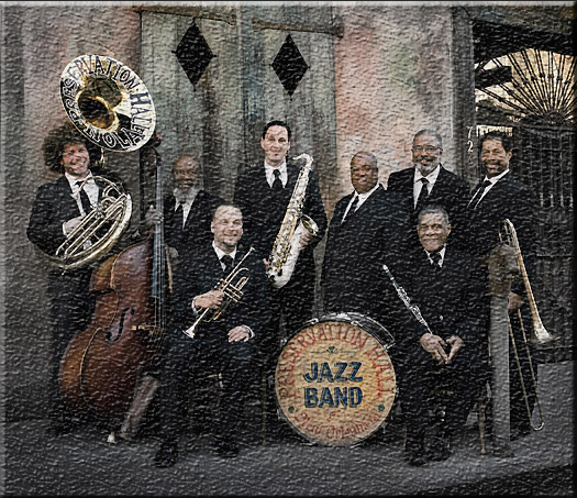
I am on page 9-35. I have to use image of jazz bands and edit them with filters and styles.
|
I am on page 9-35. I have to use image of jazz bands and edit them with filters and styles.
0 Comments
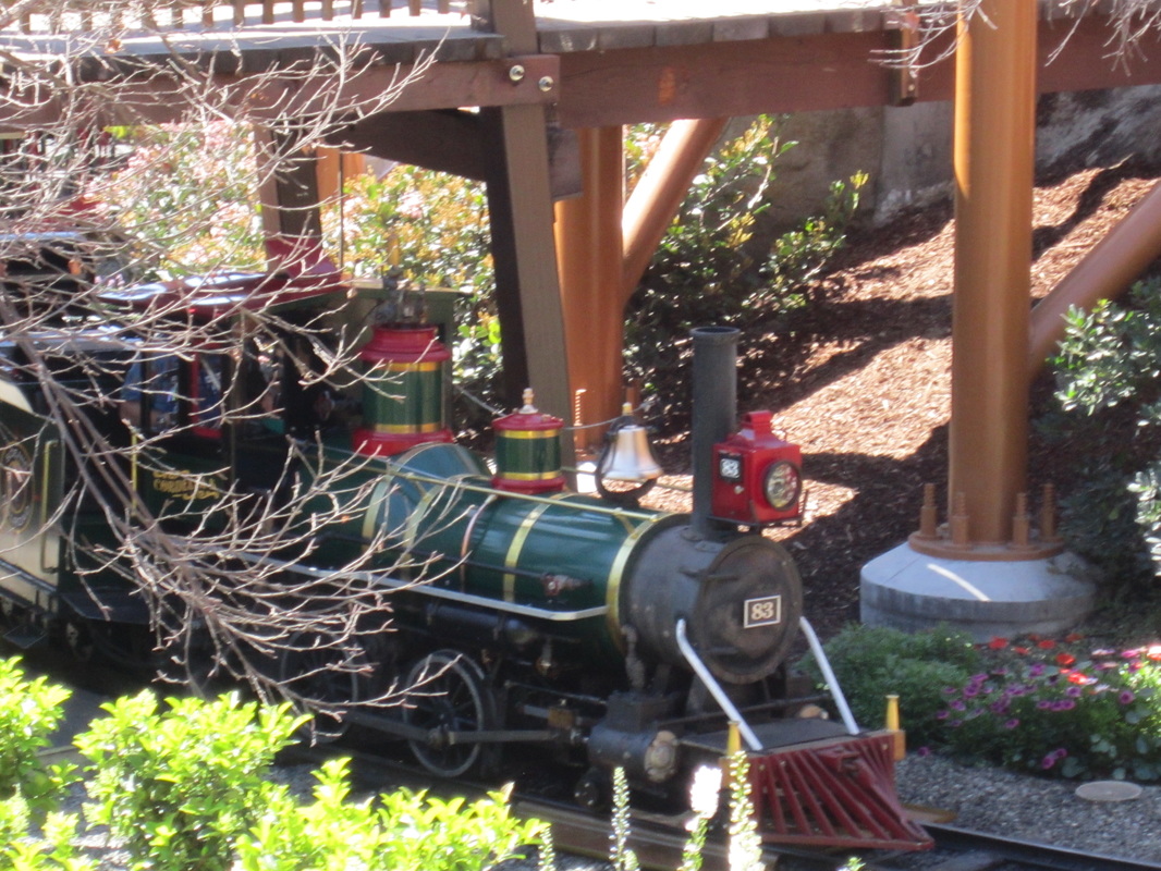
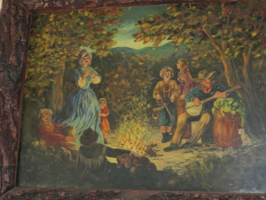
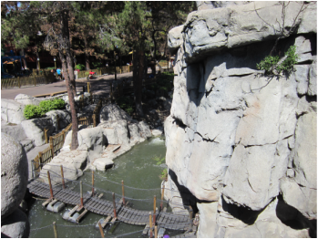
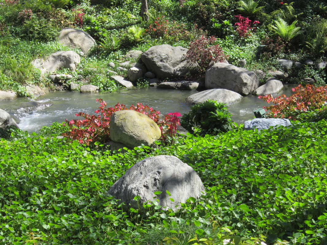
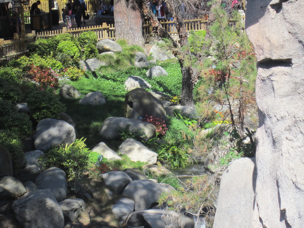
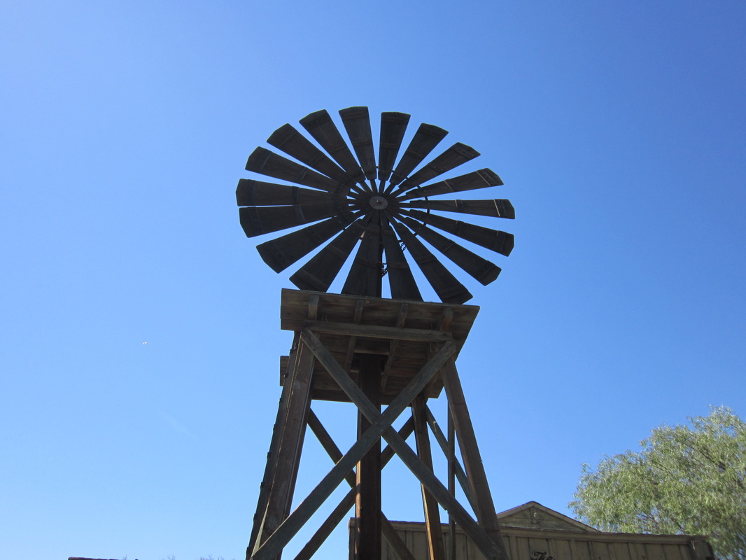
Here are some pictures from when I went to Knott's Berry Farm a while back. I tried to go for interesting pictures with good contrast or had bright colors.
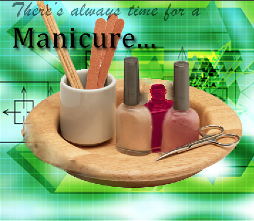 I just finished tutorial 8-3 on page 8-36 of Adobe Photoshop CS6 Revealed. It involved using layer masks and the healing brush tool.
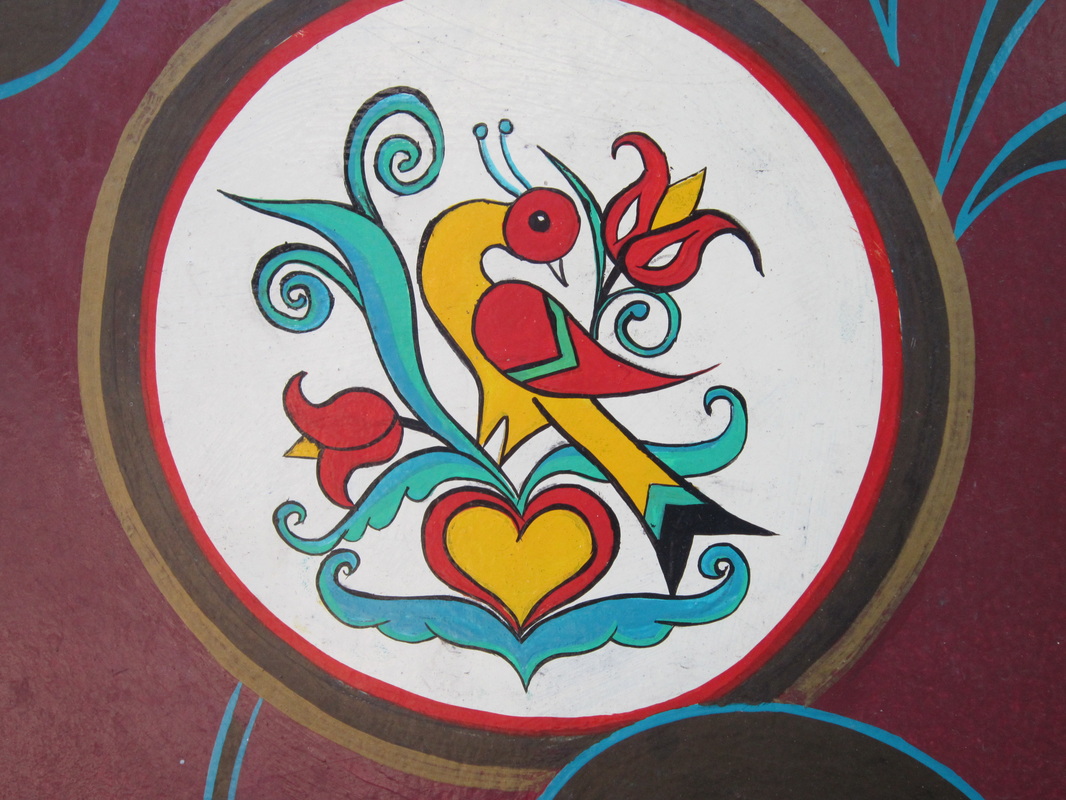
I decided to add color because I thought it would look better.
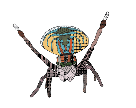
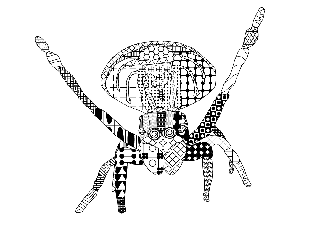
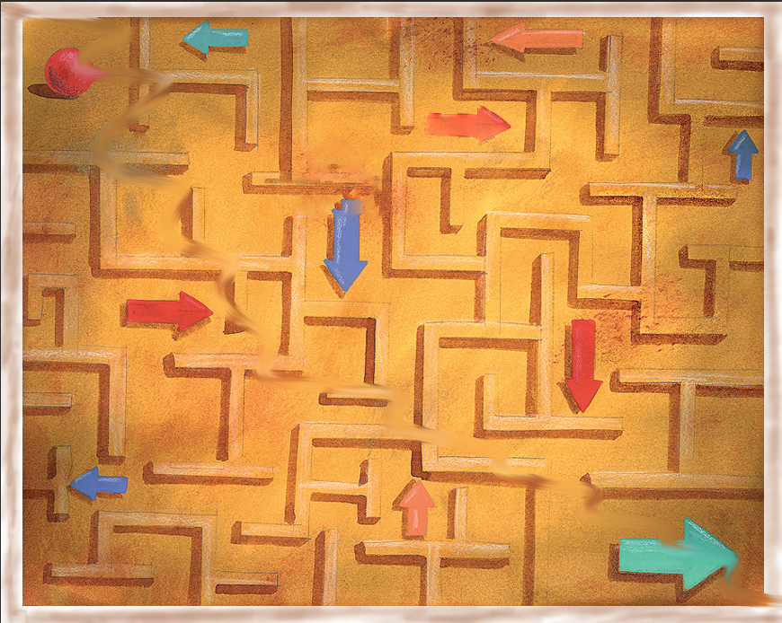
I just finished my zentangle project. It is a picture of a peacock spider. I am on tutorial 7-2 (The Maze) on page 7-25.
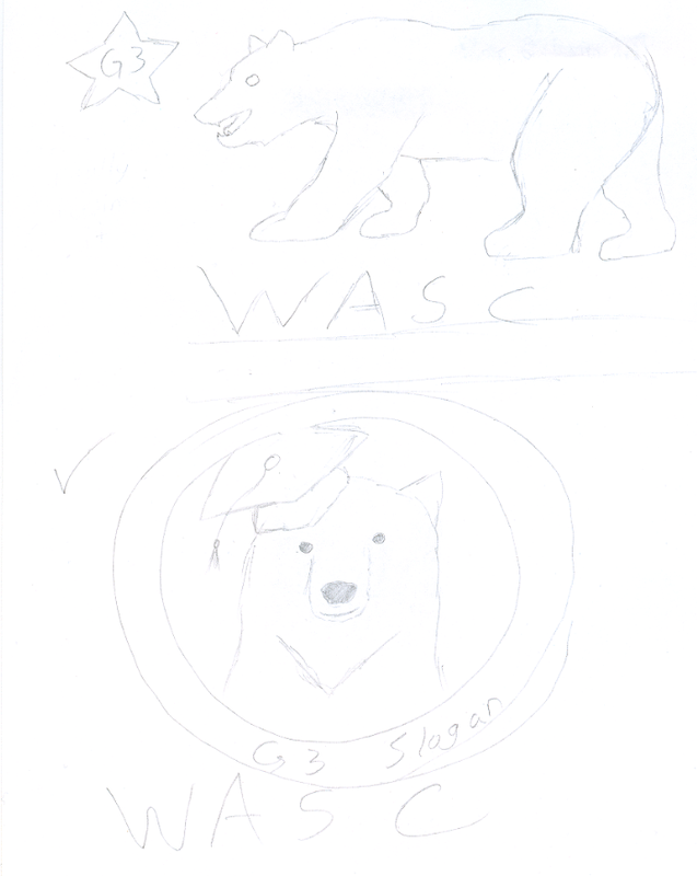
The final design compared to the original differs only in 2 ways: I removed the word WASC and added the gearUP logo in the bottom corner. I liked the original design better because it felt more complete with text at the top and bottom of the gold circle, while the final design is empty at the top. I will say that having the gearUP logo in the bottom right does add some flair to it, but having the top part empty just doesn't fit well with me. Overall, I really like how the bear came out and I think it looks amazing. It doesn't matter if I won the contest or not, i just really like how this art came out.
1) What I liked the most about my t-shirt design was how all of the colors came together to create an easily identifiable subject.
2) What I would do differently, if I had more time is add fur to the outline of the bear, making it less smooth, and make the eyes easier to see compared to the fur around it. 3) What I learned about quick deadlines is that they make it harder to work because it makes you have to come up with ideas quickly in order to get the project done on time. 4) What I like about working in Adobe Illustrator is how easy it is to add color to specific parts of a picture and still make it look professional. Finished design on the left. Sketchpad on the right. I partnered up with Alexious Jimenez.
I am currently working on my zentangle thumbnail sketches. I am on tutorial 7-1 on page 7-18. 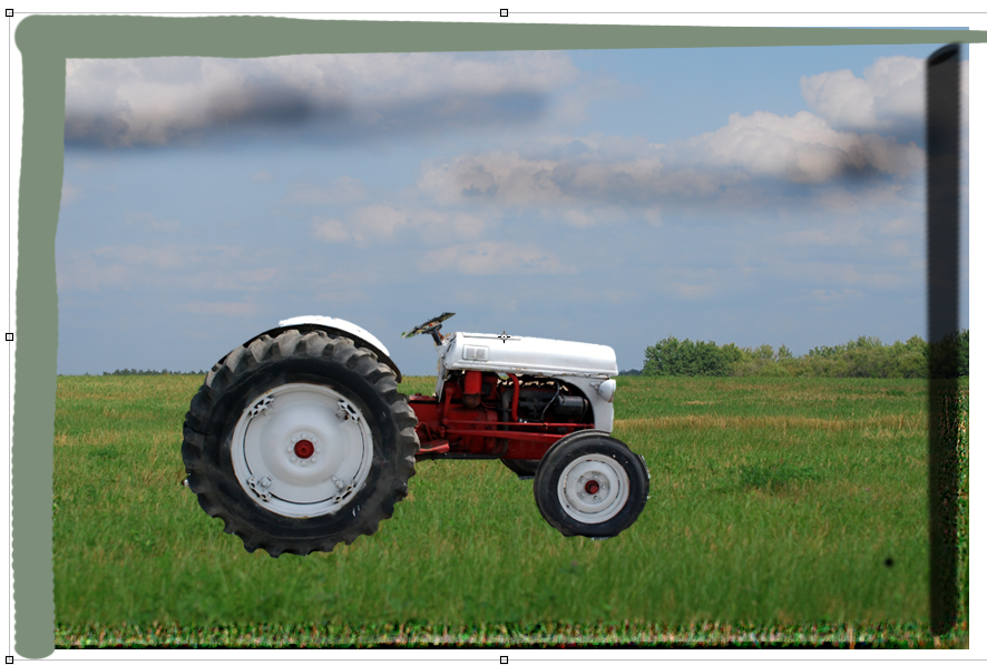
|
AuthorWrite something about yourself. No need to be fancy, just an overview. Archives
May 2015
Categories |


 RSS Feed
