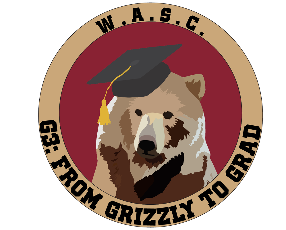
Original Design
| 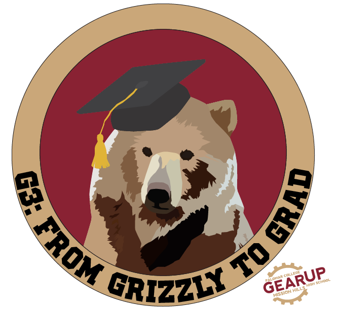
Final Design
|
The final design compared to the original differs only in 2 ways: I removed the word WASC and added the gearUP logo in the bottom corner. I liked the original design better because it felt more complete with text at the top and bottom of the gold circle, while the final design is empty at the top. I will say that having the gearUP logo in the bottom right does add some flair to it, but having the top part empty just doesn't fit well with me. Overall, I really like how the bear came out and I think it looks amazing. It doesn't matter if I won the contest or not, i just really like how this art came out.
 RSS Feed
